Logo Design
Existing Logos
I have looked around on the internet for some already existing logos for some inspiration.

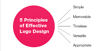
A good logo is distinctive, appropriate, practical, graphic and simple in form, and it conveys the owner’s intended message.
Simplicity: Simplicity makes a logo design easily recognisable, versatile and memorable. A good example of a simple logo would be the Nike or Adidas logo.
Timeless: Being Timeless means to stand the test of time and if your logo will still be effective in years to come. A great example of a logo that is timeless is coca cola logo and how little it's changed through the brands history.
Versatile: A Versatile logo works across a variety of media and applications. Things to keep in mind are :
- Is it in one colour?
- In reverse colour (i.e. light logo on dark background)?
- Is your Logo a suitable size
This is a good example of a versatile logo because the colours contrast well with the light and dark colours, It isn't too big or small for what it is therefore would work well to put on different products.
I like to work first in black and white to ensure that the logo will look good in its simplest form. Color is very subjective and emotional. This can distract from the overall design - say if you saw your logo in all red, that color may be the first thing that you respond to and not the composition of the design elements. I will not even consider submitting color suggestions to a client for review until they have signed off on a final black and white logo. — Patrick Winfield
Appropriate: is your logo suitable for your target audience. Are the colours suitable? is the design suitable? A logo doesn't need to show what the company offers which is a common misconception with logo design. A logo doesn’t need to say what a company does.
"Restaurant logos don’t need to show food, dentist logos don’t need to show teeth, furniture store logos don’t need to show furniture. Just because it’s relevant, doesn’t mean you can’t do better. The Mercedes logo isn’t a car. The Virgin Atlantic logo isn’t an airplane. The Apple logo isn’t a computer. Etc." — David Airey
Logo Attempts
This is my first attempt at a logo. To create it I used photoshop 2021 and the tools inside it. I decided to stick with a red and white colour theme which you can clearly see throughout. I managed to source a graphic that shows some of the landmarks in the local area which will help appeal to people in the local area but also show people further away from where I am located. I decided to use 2 contrasting fonts to help with showing the brand name and what we offer. I like the contrast and the way I have blended the text in with the image to help it flow. I applied the same hue/saturation effect on both of these to help keep things the same. Overall, I like this design but I think with the image in the middle it gets a bit too busy.
From my thoughts, I decided to create a feedback to find out what different people thought about the design.
From this form, you can see I have asked a variety of questions to gather enough feedback from valid responses. I kept the questions fairly simple so that the person filling it out can respond quickly and effectively.
From the feedback, I have received regarding this logo design I can see that people believe that the large graphic in the centre is too much for a logo and is too distracting, for that reason I have decided to remove it for my next design. Also in the last response, I see someone recommending a simple but contrasting logo so this could be a great idea as it won't be over complicated and will still get the job done.
To create this logo I simply inserted a black square into photoshop on a blank canvas
 |
| The rectangle tool used to create rectangles |
After inserting my new background I simply sourced a modern font from the internet. I then wrote my desired text out with the text tool in photoshop
 |
| Photoshop's text tool |
I wrote out my desired text and positioned it how I felt looked good and then exported it. Therefore showing how this logo is simple and effective as it is rather simple to make with it just being text with no graphics to over-complicate it.


Comments
Post a Comment