Website Design
Website Design
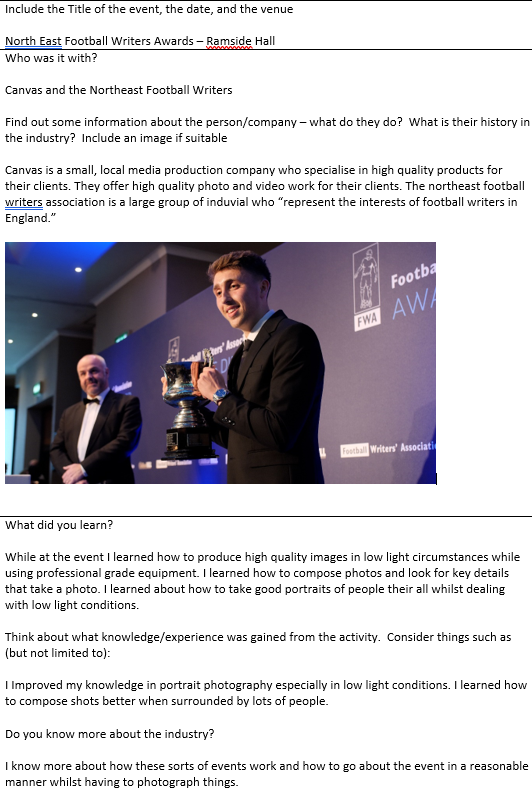
Home Page

This is my home page which is the first screen you are taken to when entering the website. It consists of headings to take you to different pages within the website, social media links to take you to different social media accounts and also shows the viewer the most recent project I have completed in this case it was a Halloween event in the town centre, this can be paused if the viewer does not wish to watch it. The background is a picture of a local landmark that I have taken and is being used to show where I am currently living and also gives a sense of regional identity. I have used the opacity tool to make the picture more opaque so that the text and logo stand out more and can be read more clearly. I have kept the black logo text theme running through the page by keeping all the text on the site to black colour, the only thing I have changed is the size and colour so people can easily distinguish what is the logo and what isn't.
Portfolio Page

This is my portfolio page and is where I showcase the content that I create. Currently, on the page, I just have image albums to sort images that I have taken but will be adding video to these pages soon. The background of this page is another local landmark that I have photographed and editing so is particularly effective when used in contrast with the solid black hues on the page. I have used the opacity tool on the background image again just to help the test become more clear and easier to read. I have kept the same design as my first page to keep a sense of professionalism and to keep the website tidy. I have the same headers and social links as the home page and I think this is a very effective layout.
Contact Page

This is my contact page which consists of social media links and business email addresses. I have chosen to keep it rather simple as there is not much information to put on this page. I have kept the website layout for professionalism and have kept the same colours throughout. I am considering moving the text to be more central to keep the design similar to the first page. and also changing the background image to something more local to keep the regional identity theme going. The colours do work well with this image but I believe keeping the regional image theme would work better. I have included an inbuilt Facebook page tracking script so that I can post to my Facebook page it will show that post automatically on my website to keep people up to date. It also serves a purpose by directing more traffic to my Business page and helps top get noticed more often due to how easy it is to find by clicking the name it takes to right to the Facebook page.
Second Website
https://leonhutch32.wixsite.com/lhmedia
From designing my first website I have since started creating a second site. This site was to be more focused on the brand colours and fonts as opposed to constantly showing off my work.

This is the newly reconstructed home page. It consists of the brand logo which is the main feature of this page due to the size I have made it. I have also included the two main areas I am interested in underneath that to help the viewer understand what my interests are, this is then followed by my most recent project, in this case, the Halloween parade.
I have kept the colours black and white to really showcase the brand's identity and keep a simple but effective colour scheme throughout the website which helps promote the brand's identity.

This is the content page that showcases some of the content that I have produced either video or photo. The top of the screen consists of photos but as you scroll to the bottom you find a strip of videos that can be played.

The overall design of the page is kept to the same as the home page. This is to keep continuity within the page and help get the brands identity across to the viewer which will help them to remember the brand. I need to put my own photos on the site as these stock photos are just placeholders.
I have a showreel page however that currently only has a collection of videos as I have not made a showreel at the moment. This is something that I need to create for the page.

I also have a small about me section where I briefly describe who I am and what I do. This is kept rather basic so it doesn't make the reader lose interest. I have kept the same theme and colours throughout so it can be a recognized colour scheme and be associated with the brand.

And finally, I have chosen to include a contact page that has my social media pages and business email on so that people who are interested in my content can see more of it or can contact me regarding anything. I have added embedded apps that showcase my work allow people to click and view them and also allow easy access to my work. I have also kept to the same colour scheme and layout that is consistent with my current design so these select colours can become heavily associated with the brand's identity.

I have since collected some feedback about my website in which I can gather valid points that will help me make changes to my site and improve it. I have done this with help from Google Forms, by making a survey and sending it out to some people to collect feedback.

This is my form which includes questions about my website to help make corrections and improve. As you can see it is rather simple and easy to fill out by using a simple answer format that makes it easy to give valid feedback. I have since gotten the results back and made the relevant changes to my website.

As you can see most of the tick box questions came back with positive results and people find my website easy to use. This is great as it means I don't need to make changes to the layout or make the site easier to use.

These is the results from the direct feedback where people can express their views and opinions by writing them down in text. As you can see people like the layout and colour scheme of the website which is great as this means I don't need to make any drastic changes to what I already have. Regarding the changes people want to see they have picked up on adding more content which is a valid point seen as I sent out a link to an unfinished website so I didn't have to go back through a live website and create changes there, I can do it before it goes live. We can see people asking for photo and video content and creating a showreel for that page.
Since these questionnaires came back I have made most of the changes to my website by including more photo and video content to make the website look better and more professional.


As you can see I have included a large range of photo content to help show what I am capable of, everything from Product photography to car and aviation photography. This will help anyone who looks on my site to make a valid judgement of what I enjoy doing and see my work. These images can also be changed over time therefore I can always update people on what I am up to and some of my best work. As this is used as my website outside of college for my own personal work content may vary.


Comments
Post a Comment