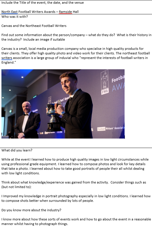
Business Cards
Business Cards
A business card is a small card printed with one's name, occupation, business address, etc. They are used when promoting a business.
When designed correctly, your business card reminds people of the first time you met and encourages those who are interested in your products or services to get back in touch or visit your website for more information. Knowing what to add and what to leave out helps create a card that’s both eye-catching and well-balanced. Try not to only focus on the graphic elements and text you want to add, but consider the space around them too.


Front

Back
This is my attempt at designing a business card, I rather like the simplistic front design and then all the information on the back of the card. The design has a good contrasting colour scheme keeping with the theme of my brands' logo. It has a QR code so people can scan and be directed towards my website. If I was to redesign the logo I would maybe put a small border on the card to help show the edge of the card and to aid with the design.
To create my business card I started off by looking for existing products to see if there were any common themes that are usually followed. I then decided to just have a go and came up with the front of the card above. This was created in photoshop and with the help of the colour fill tool allows you to create some nice backgrounds.

This allowed me to get the background that's on the front of the card. I then simply used the PNG version of my logo to put my logo without a background onto my card, this could have also been done with the magic wand tool within photoshop which is really helpful when wanting to remove a clean background.
 |
| Magic wand tool within photoshop |
I then decided to add a white strip to help my website link to stand out with a high contrast colour which in this case was black as it contrasts really well with white.
For the rear of the card, I decided to keep the contrasting theme going with a split colour design. The red colour was to help with a bit of regional identity to contrast with the white to portray the Sunderland AFC kit colours. The white text popped out on the darker background with the red adding a bit of spice to the design. The black QR code was added as a website shortcut and stands out nicely on the white portion of the rear of the card.
For this design I created a google form to help gather feedback about it to see what people think.

From the feedback I have collected I can see that people do like the design but could be improved if I wanted to. I could improve my design by giving the design more of a personal touch, this could be by making the card just the brands colours or add my logos font onto the card to make it look like it belongs in my brand. I may look at designing another business card later on depending on how I like the design and if I continue to like it.

Comments
Post a Comment